Saturday, February 23, 2013

Sun, Tower, Airplane by Robert Delaunay

       Before discussing Soliel, Tour, Aeroplane (Sun, Tower, Airplane), it is important to connect the themes of the work with the historical context those themes represent. The Eiffel Tower was completed in 1889, proving the strength of metal as a strong, sturdy, and long-lasting material that allowed buildings to reach higher than ever before. In 1906, the Wright Brothers completed the patent for the airplane, allowing people to fly higher in the sky than buildings like the Eiffel Tower. The airplane's success was demonstrated by Louis Blerot, who succeeded in crossing the entirety of the English Channel in 1909.
       
Sun, Tower, Airplane, Robert Delaunay, 1911, oil on canvas


       The titular elements of Sun, Tower, Airplane are portrayed in a colorful and geometric arrangement of shapes typical of Cubism. The sun, Eiffel Tower, and the biplane in particular are all re-arranged into differently shaped segments that still allow for the discernment of their forms. The work as a whole stands as a proud monument to the recent achievements of humanity: flight and towers to reach ever higher into the sky.
       Robert Delaunay reused the colorful style of Sun, Tower, Airplane on a work he completed the following year in 1912 titled Simultaneous Contrasts: Sun and Moon. The same whimsical and flowing color style is used to represent the sun and, to a lesser extent, the moon. As is evident, Delaunay's style of cubism took elements from Fauvism and Expressionism with its bright and intense coloring that was designed to elicit an emotional response from the viewer.


Robert Delaunay. Simultaneous Contrasts: Sun and Moon. Paris 1913 (dated on painting 1912)
Simultaneous Contrasts: Sun and Moon, Robert Delaunay, oil on anvas, 53" diameter.

       Delaunay was part of a movement known as Section d'Or (literally Golden Section). The movement included other artists like Fernand Leger and Frantisek Kupka, who also had cubist elements in their works.


For more information on the Wright Brothers check out:
http://www.wright-brothers.org/default.htm

For more information on Robert Delaunay's life check out:
http://www.visual-arts-cork.com/famous-artists/robert-delaunay.htm

Girl with a Mandolin (Fanny Tellier)

The most remarkable thing about Picasso's work is undoubtedly his ability to transcend the limits of the   one dimensional human mind. When one looks at a work of Picasso's during his Cubism phase this is especially prevalent. Traditional art has typically always included some type of regard for who it's audience is, and where that audience should be. This take on perspective ranges in its application from back in ancient art where sculptures dd not have a back or a side to them, because they were meant to be seen from one angle, ie the "front." The artist was limiting his viewer in a way by doing this. By showing only one perspective, there was no choice as to the interpretation. Later, however, sculptors started adapting to make art that could be seen from a number of different angles and the audience was not confined to one perspective.

Paintings used to essentially be the same way. The artist would paint assuming one vantage point and paint only considering that angle. Picasso and the cubist movement were able to revolutionize this idea. For paintings of Picasso's, like "Girl with a Mandolin (Fanny Tellier)", there is no set angle. The perspective can be whatever one tries, or chooses, to see. There is shading and shadows from many different places, yet somehow they all work as a cohesive unit.
Part of the indication of this technique is that the human experience is not concrete. By allowing more viewer analyzation Picasso is allowing his audience to also become part of the art. It is no longer something definite, but something that changes with whoever is looking at it. Further, the dimensions that the art is set in go beyond visual stimulation. With "Girl with a Mandolin (Fanny Tellier)" , the element of music is also expressed through the movement the painting conveys. What I immediately drew a connection to in this sense was Picasso's "Three Musicians". I remembered seeing a video when I was younger where the same painting actually did move. I found the video, and it turns out that it is from Sesame Street and thus aimed at young children. By having the movement incorporated with the technology we now have access to, even when the video is over, movement and music are still even more associated with the art. Despite the movement being aimed towards a younger viewer, the idea of using video to make art almost "adapt" in a way to modern times and interpretation may be something to look at for the new visualization space.

Friday, February 22, 2013

States of Mind: Those Who Stay

Those Who Stay, by Umberto Boccioni is a moving piece in that the people whom he painted here are all basically heartbroken and don't know what to expect in the coming days, or weeks. They have sent their loved ones off on a train that is unknown to them during this time. They don't know if they will ever see them again after this day. I believe the sadness and disparity is also brought out in the fact that Boccioni didn't paint the scene as a bright, sunny day that they have had to say farewell to their lovers or family. He paints it as a dark and stormy night because that is what's going on in the people's lives at this moment. Their thoughts are askew, their hearts are forlorn, and they can only hope that they will see their loved ones again. 
On a teaching literature blog comparing the series of States of Mind to the popular movie the Hunger Games, this particular painting is compared to the feeling and the moments where the families are sending their children who've been chosen to be in the Hunger Games. They don't know what they will face in the coming days. They don't know the obstacles that their young children are going to have to go through. They know that the possibility of them coming back to them is slim to none. Much like the mindset of the people Boccioni has painted for us here. This painting may have been influenced by Joseph Turner's Rain, Wind, and Speed that was produced around 1844. 

This painting also depicted a train and the new technological innovations that were happening around that time. Though, J M W Turner's painting is much happier. The colors are beautiful and bright. It makes the viewer excited for the future of technology much unlike Boccioni's painting here makes a viewer much anxious and afraid of not only trains, but the whole direction that the world was moving in regards to technology at this time. 

(The) White Girl Problems

Symphony in White, No 1 (The White Girl)

Painted in 1861, Whistler originally intended Symphony in White, No. 1 (sometimes referred to by it's original name The White Girl) to be displayed in the prestigious annual exhibition of the Royal Academy, although when he submitted it Whistler apparently expected it to be rejected:

"I note that The White Girl has made a a fresh sensation for and against, some stupid painters don't understand  it at all […] perhaps the old duffers may refuse  it altogether"

White Girl was submitted to the Academy along with three etchings, all three of which were accepted, while the painting was not. Instead it was exhibited at the Berners Street Gallery in London, where it was shown under the title The Woman in White, also the title of a popular novel at the time by Wilkie Collins. It was this coincidence that made English critics of the time see the painting simply as an illustration rather than a completely original work of art. One critic called it "...one of the most incomplete paintings we ever met with." and many were disappointed with its lack of resemblance to the novel's heroine. Whistler detested this view of The White Girl. A firm believer in "art for art's sake" Whistler asserted that the gallery chose the title without consulting him, and said:

 "I had no intention whatsoever of illustrating Mr Wilkie Collins' novel. My painting simply represents a girl dressed in white standing in front of a white curtain."

In the Gazette des Beaux–Arts, Paul Manz referred to it as a "symphony in white," noting a musical correlation to Whistler's paintings that the artist himself would address in the early 1870s, when renaming many of his works. This musical analogy further emphasized Whistler's philosophy that the composition was the central thing, not the subject matter. The title was probably also inspired by ThĂ©ophile Gautier's 1852 poem Symphonie en Blanc Majeur.

Sources:

http://en.wikipedia.org/wiki/Symphony_in_White,_No._1:_The_White_Girl#cite_note-17

Wassily Kandinsky: Improvisation 28 & Composition II


Wassily Kandinsky is credited with painting the first purely abstract paintings. Looking at his two paintings Improvisation 28 (below) and Composition II (right), it is clear why. Marked by confident brush strokes that seem to abandon the creation of form and bright patches of color, the two paintings  stand in stark contrast to the early paintings of Kandinsky. M.K. Lacoste had this to say on Kandinsky's change in style:


"What prompt evolution from 1908 to 1914 - from landscapes, though bold already in color and form, but still true to nature, as "Houses in Murnau on Obermarkt" "(1908) It would be difficult to guess a hand of the same artists in such an abstract work, as "Composition VII", 1913, despite their common dynamics. Here - a constrained impulse, there - a liberated movement".
Moving away from the landscapes of his earlier work, starting in 1909, Kandinsky became increasingly concerned about painting apocalyptic narratives rather than the portrayal of natural events. Nancy Spector comments:
"In both Sketch for Composition II and Improvisation 28 Kandinsky depicted—through highly schematized means—cataclysmic events on one side of the canvas and the paradise of spiritual salvation on the other. In the latter painting, for instance, images of a boat and waves (signaling the global deluge), a serpent, and, perhaps, cannons emerge on the left, while an embracing couple, shining sun, and celebratory candles appear on the right."
Also during this time Kandinksy was increasingly influenced by music, in particular  Richard Wagner's Lohengrin which, he felt, pushed the limits of music and melody beyond standard lyricism. Born with synesthesia, Kandinksy experienced art very differently than most. Hearing tones and chords as he painted, he theorized that (for example), yellow is the color of middle C on a brassy trumpet; black is the color of closure, and the end of things; and that combinations of colors produce vibrational frequencies, akin to chords played on a piano.
"Colour is the keyboard, the eyes are the hammers, the soul is the piano with many strings. The artist is the hand which plays, touching one key or another, to cause vibrations in the soul"
-Wassily Kandinsky

A full description of his theories on colors can be read in Kandinsky's book: Concerning The Spiritual in Art

Sources:


Banksy


From NPR.org: After Uproar over Removed Mural in London, a New Banksy-Like Work Appears

Avatar: The Exhibition

Avatar: The Exhibition

Portrait of Chess Players by Marcel Duchamp (1911)


I am wandering in my own thoughts thinking that this is merely the interaction between two chess players in deep concentration, but as always a little research brings me on the most amazing cyber journeys. Thank you, technology.
 I strongly encourage you to see the first posted sources in the bottom of this blog. It is well rounded and extremely informative. I am going to try not to get into them so that I can keep it strictly artistic.

Interpreting this paining can be a little hard due to its abstractedness. Though, it is illustrated that the chess player on the left back in pondering for his opponents move. It would seem like he (most likely a he) is whistling ergo the small black abstract figures in the middle of the image. If one put great focus, it looks as if there is resembles of a king (possible the chess piece most observed by a player, other figures are too irregular to interpret for me, but also I see what could resemble a Caribbean flamingo.


Here is a close up, but I cannot completely interpret this without saying that it is the player’s soul’s soundscape.

Now to the part of the image that I find interesting, the second players constantly moving head. It would look like he chess player is taking sneak peeks at us, audience, the chessboard, and just in the general, his surroundings. I say that hence the contour that is manipulated with the gradient of the represented colors. Observe the contour of his head and his resting elbow, and left underarm.

Here is a visual example of my observation of the second mentioned chess player.


I hope this makes my point clear. Our artist has an extremely difficult relationship with the game, chess, and that is how he resembles his everlasting spark.
Sources:
1. http://web.ebscohost.com/ehost/pdfviewer/pdfviewer?vid=11&sid=8f3c9b44-02b6-4f54-98b5-5a4a102bf146%40sessionmgr14&hid=19

Link number one does not work properly due to the fact that it is a educational institution research base, so here is some information that will help you look up what I read to create my blog. Enjoy the search!


Authors:
Cross, Lowell
Source:
Leonardo Music Journal; Dec1999, Vol. 9 Issue 1, p35-42, 8p
Document Type:
Article
Subject Terms:
*ELECTRONIC music
Reviews & Products:
REUNION (Theatrical production)
Abstract:
The author chronicles his involvement in Reunion, a 1968 collaborative performance featuring John Cage, Marcel Duchamp and Teeny Duchamp, with electronic music by David Behrman, Gordon Mumma, David Tudor and Lowell Cross. After addressing some misconceptions about Reunion, the author outlines specific details about the conditions surrounding the performance and the sound-distributing chessboard he built, then offers an interpretation of the event. [ABSTRACT FROM AUTHOR]
 
Copyright of Leonardo Music Journal is the property of MIT Press and its content may not be copied or emailed to multiple sites or posted to a listserv without the copyright holder's express written permission. However, users may print, download, or email articles for individual use. This abstract may be abridged. No warranty is given about the accuracy of the copy. Users should refer to the original published version of the material for the full abstract. (Copyright applies to all Abstracts.)
ISSN:
09611215
DOI:
10.1162/096112199750316785
Accession Number:
5337412
Database:
Academic Search Complete


Portrait of Madame X


 John Sargent's "Portrait of Madame X" evoked much disapproval from the contemporary art critics. In a gallery where paintings of naked women hung on every wall, this painting appeared too erotic for the audiences approval. Most of the time prostitutes modeled for artists, but in this piece a parisian modeled in a very bare chested dress. The original piece even showed the girls left dress strap procariously falling over her shoulder.  This made it too personal for the viewers.
The subject of the piece, Madame Gautreau, came from America. She married a rich banker, and she became part of the lazy upper social class in Paris. She became known for her unique yet captivating look. She became Sargent's Galatea, and he her Pygmalion. Sargent made sketch after sketch of her in oil paint, charcol, pencil, and watercolor. He slaved to refine the "Portrait of Madame X" as a hommage to her beauty. Madame Gautreau approved of his work.
Sargent reluctantly presented this piece in the 1884 Paris Salon, and upheaval ensued. Not only did this high-class woman appear in scant clothing, but she wore thick, violet tinted makeup and posed in a very arrogant pose. Most people were outraged, some were appreciative, Madame Gautreau wavered between indignant and pleased, and Sargent felt immense social rejection. This piece scarred his contemporary reputation as an artist, and it took many years for him to recover.

http://www.thedailybeast.com/articles/2011/05/22/the-scandal-of-madame-x-excerpt-from-david-mcculloughs-the-greater-journey.html

http://www.jssgallery.org/Paintings/Madame_X.htm

Thursday, February 21, 2013

German Expressionism

German Expressionism

Relational Aesthetics and Postproduction

Relational Aesthetics and Postproduction Prezi

Homer's Lightened Up Memory

One thing I find particularly interesting about 19th Century American Art is its ability to balance detail and subtlety. Many of the paintings that came about during that time are precise and accurate at first glance. However upon further inspection it can be seen that the paintings themselves were in reality quite simple.
For example, we may consider Winslow Homer's Prisoners from the Front. Homer creates a scene in which it appears that a large group of men are gathered. It is a very realistic portrayal of an event that could very well take place in a 19th century war grounds. Thus, the scene is accepted by more traditionalists in art. It is in fact though quite a simple piece of art. Homer uses very few different colors and instead puts an emphasis in his work on the amount of layers of paint he uses and the shapes he executes. The result is an almost posterized scene. forms and color take precedent over hard lines and contrast. It in turn makes the work retain an element of serenity.

By creating a picture with this modern color scheme, Homer takes us to the scene almost as if in a dream or a long passed memory. As a result, this more relaxed message is much welcome after the stark realism which preceded it.

Wednesday, February 20, 2013

Winslow Homer: One Country, Two Sides to a Story

Winslow Homer (1836-1910) was an American painter that was skilled in portraying works with an unbiased eye so that it appealed to both sides of a story.
His most famous works are of the paintings that he created with Civil War scenes. One of his earlier works (on the right), The Sharpshooter on Picket Duty 1862 reveals a Union sniper aiming to what we assume is his next Confederate target. This one of the most important Civil War pieces for it illuminates what the war actually was, Americans killing Americans. This had a deep impact within the society for it brought forth noting the horrors of the war and forced them to acknowledge that they are killing their own people. Homer too was affected deeply by this stating, "[the sketch] struck me as being as near murder as anything I could ever think of..." (Winslow Homer: Civil War Sharpshooter) In this particular piece he is demonstrating that there is not "two sides" to this story but only one side for we are all Americans.
Another Civil War piece by Homer (left), Prisoners from the Front, depicts captured Confederate soldiers by the Union soldiers. Well that is what we can tell, but if we look closely to the body language of the figures, maybe "captured" is the wrong term. Here, Homer is appealing to both Northerners and Southerners by the mere means of the body language of the men. The Union soldier in the front stands tall and is a dominating force of the work, but the Confederate soldier in front is a near mirror of posture. Interpreted by a Northerner one would think "well done soldier, taking prisoners of war," while an interpretation by a Southerner could very well be "well done soldier, you may be captured but you hold your beliefs and dignity." (Winslow Homer...)
By bringing to attention that we are all Americans and appealing to the two sides of the story Winslow Homer is able to connect to the country as a whole. Though the North and South was still very different after the war, each side could still appreciate Winslow's work almost in a means of unison.  

The Laughing Child

The Laughing Child, by Robert Henri, i feel was kind of like a slap in the face to the people who thought that people who were less fortunate, or poor, needed to be rescued. That they couldn't be happy because they didn't have everything that the wealthy had. This painting shows that kind of people that even if a child doesn't have all of the big homes and vacation homes, nice clothes, and money to go to parks to enjoy leisure activities, they can be extremely happy and feel just as fulfilled and sometimes more fulfilled than the children of wealthier parents. The child depicted in this painting seems to know that she means the world to her parents, something that the children of wealthier individuals may never have felt their entire lives. In a book called Hidden Fields, this painting is paired with several songs that a viewer or listener may feel are appropriate to be alongside this picture. A Child's Laughter by David Stanley Smith is one of the songs that is paired with this painting along with Variations on a Nursery Tune by Ernst von Dohnanyi and others. Also, there is a poem which is paired with this painting that is influenced by it and reflects some of the same aspects. It talks of the girl being, "God's gift to our arms" presumably her parents. "She is love, unconditionally, like her laughter." This poem speaks of the laughter that someone would have heard if they had been in the same room with this beautiful young child who is thriving in life even though she isn't the most wealthy.

Pablo Picasso, Georges Braque, and the beginnings of Analytic Cubism

       Pablo Picasso and Georges Braque are considered by many to be the founders of Cubism. Indeed, the two worked together from 1909 to 1914, drawing inspiration from recently deceased artist Paul Cezanne to create the style of Cubism, which eventually evolved into Surrealism.
       Before meeting Picasso, Georges Braque was invested primarily in Fauvism, which was a style that Henri Matisse worked in that utilized bright colors and loosely defined forms (similar to Impressionism) to achieve an emotional response (similar to Expressionism).


The Great Trees, L'Estaque (1906-07) by Georges Braque, oil on canvas, 31.5", 27.75".


        Compare this work side-by-side with one of Matisse's Fauvist works.


Luxe, Calme et Volupte by Henri Matisse (1904-05).
       Pablo Picasso and Braque first met in 1908, and both artists frequently exchanged ideas as they worked. These discussions eventually evolved into Cubism, which was a new take on the familiar academic rules of linear perspective. Normally, linear perspective creates the illusions of three dimensions through receding lines and shapes. Cubism takes a different spin on linear perspective by breaking the elements into polygons and re-arranging them in ways that still allow the viewer to discern their forms but also shatter the formal rules of perspective at the same time.


Pablo Picasso, Three Women, 1907-1908, Oil on Canvas, 6' 6.75" * 7' 6.5"
        One of Pablo Picasso's most famous cubist works is Three Women. It is effectively the second draft of a similar work that he had painted a year earlier, titled Les Demoiselles d'Avignon.


Painting: Pablo Picasso. Les Demoiselles d'Avignon. 1907.
Pablo Picasso, Les Demoiselles d'Avignon, 1907, Oil on Canvas, 8' * 7' 8".

       As can be seen, both works feature nude women, but when Cubism is applied, the women's bodies and the backgrounds of both works are fragmented into shapes that aren't always perfectly symmetrical, as one might expect from an academic work. It was this lack of symmetry as well as foreshortening that challenged the viewer to look more carefully at the space within the works. The inspiration for these two paintings stemmed primarily from Picasso's inspiration from some imported African masks that he got a hold of, and his experiences in a brothel, which he decided to convert into these works.


A Ngil mask of the Fang culture of Gabon which was sold at auction 17 June 2006 for the record sum of $7.5 million, the highest price ever paid in the world for a work of primitive art.
This mask, from West Africa, is considered by many to be the inspiration for Les Demoiselles d'Avignon.

       Taking inspiration from Picasso, Braque also began dabbling in Cubism as well, bringing in the theme of musical instruments in 1909 when he went to Paris for the winter.


Georges Braque, Violin and Palette, 1909, Oil on Canvas, 36.125", 16.875"


       Cubism would continue on to pave the way for Dada and Surrealism.


Sources:
http://www.vanityfair.com/online/daily/2011/10/georges-braque--from-fauvism-to-cubism#slide=1
http://www.georgesbraque.org/
http://www.henri-matisse.net/artofmatisse.html
http://www.metmuseum.org/toah/hd/cube/hd_cube.htm
http://www.hermitagemuseum.org/html_En/03/hm3_3_1_8c.html
http://www.moma.org/explore/conservation/demoiselles/history.html

Freudian Psychoanalysis & Cultural Studies

Freudian Psychoanalysis

Cultural Studies

Stag at Sharkey's by George Bellows (1909)


George Wesley Bellows, better known as George Bellows was an American painter belonging to the Ashcan School where he was a student of Robert Henri. The Ashcan School tend to be perceived as if they paint anything, but from lecture and a little research one quickly learns that it is more socio-realistic representations rather than everything. The Ashcan School consisted of "The Eight" and they are:

1. Robert Henri

2. Arthur B. Davies

3. Maurice Prendergast

4. John Sloan

5. William Glackens

6. Everett Shinn

7. Ernest Lawson

8. George Luks

They all had the thing in common that they show the modern world as it really is.

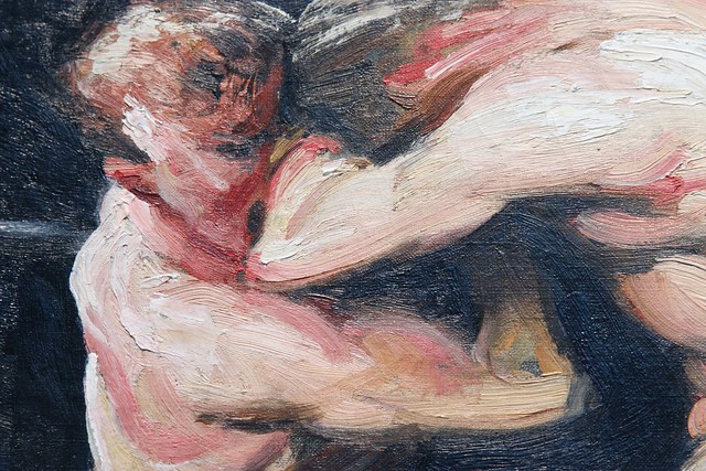
For one moment, I am going to try to look away from the artistic and focus on the esthetics of the actual painting. He snapshotted this painting on the highest moment of ecstasy.

Personal description of what I think is going on:

3rd round in this intense fight and our undefeated champion of underground boxing has put his opponent in the blood bathing stage. Furiously, the opponent is not giving up, because he cannot disappoint his betters, fans, and not to mention his own pocket. Too much contact is applied from the losing opponent while the referee is trying to disengage the fighters. In the front, you can see the happy better that is looking at the "the painter" or "us" as being the loosing better. Just milliseconds away from the painful right handed knockout punch to the jar, and the fight is over.

I feel like Mr. Bellows were trying to glorify the boxers more than the audience. The whole spectrum of audience is men, and they are there for the staggering excitement of fighting. They look very staggering, but with the only purpose of their leisure and possibly the high bets that used to be illegal at the time.

As a kick boxer myself, I know that in real boxing you do not get to a point of that much contact with heavy applied pressure from the boxing ring. Sort of like this, and that is as far as you can go.


But the interpretation of Mr. Bellows painting can lead to two different aspects.

The first aspect is the great boxing culture that has been highly promoted by the greatest fighter in the ring of all times.


Exactly, Muhammed Ali 'Clay'

The second and last aspect I like to portray is the title of the painting that did not make sense to me due to my language barriers. I figures very fast that Sharkey's was a location where the illegal fight were held, but stag was not a word I was familiar with. So I decided to make a search, and this was the very first picture I saw...


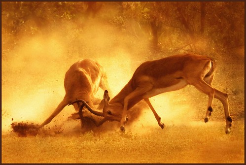
As soon as I found out what a stag is, over 100 interpretations of the painting came to my mind, but I will mention the most obvious one which is basically the stags fighting, just like the boxers.


Deep passion and determination for a sole purpose, mating, and mating only.

For the fighters, it is as well passion, but also social desirability.

Here is another version of Stag at Sharkey's. Just imagine all the scenarios of a boxing match, and how hard it would be to project such precise implications of real life.


Here is a line of different images, paintings, illustrations based of Bellows groundbreaking innovation.


Very fine articulation..

Publicly known..


I highly suggest that you visit this specific website to see some amazing representations from Mr. Bellows himself of boxing related environments.

*. http://www.starr-art.com/exhibits/Bellows/


For more information about this painting, please refer to:

1. http://www.pbs.org/wgbh/sisterwendy/works/sta.html

2. http://www.imamuseum.org/art/collections/artwork/stag-sharkeys-bellows-george-wesley

Oskar Kokoschta: Expressionism/Projection

Oskar Kokoschka (1886-1980) was a well traveled Austrian artist who produced work for about sixty years of his life.
Kokoschka was an expressionist painter for he would often do portraits in which he would distort the figures facial expressions and also play with the color in order to further portray the emotional state in the painting. He would distort the facial components of the figures in his painting by projecting his self emotional state into them, often even adding characteristics of his own facial makeup. 
The painting to the left is titled  Portrait of Adolf Loos  (1909)  that he painted of the Austrian-Hungarian architect Adolf Loos. Kokoschka projected his own emotional state into the sitter and the painting and colors chosen are the result. The interpretation of the expression can be said to be of a dark, tired, ambivalent, and tense emotion. This is taken from the darkness of portrait. He constructs a black and white painting that is dominantly black that removes any other color that could be interpreted differently. The features of the face of Loos are exaggerated overemphasizing the sunken features around the eyes. Also very notable is the figures hands. The grip of Loos is altered and is very tight in the portrait giving off a tense emotion.
The projection given by Kokoschka can be related back to Sigmund Freud. With my psychological study background I hypothesize, according to Freud's work, that Kokoschka is projecting his own emotional self by the means of his id. Freud states that we have three levels of consciousness being the id, the super ego, and the ego. The id is the unconscious that houses our instinctive drives, the ego is our conscious self, and the superego is conscious and unconscious that filters what should be brought to consciousness or repressed from the id. I believe, again according to Freud's theory, that Kokoschka's projection could be the result of a battle between his super ego and id. His id is wanting to express his true emotion which are given almost subliminally throughout the painting (tight clenched hands) while his super ego allows him to complete the painting of Loos as still recognizable of Loos himself. 

Also, not too sure the method of uploading youtube videos but here is a very interesting full documentary on Oskar Kokoschka. 
  

Gustave Moreau The Apparition


            First artist who was kind of adopted by the symbolists poets and artists called them that. I love this because in the background, he could spend all his time painting all of the shadows and colums but instead he cut it into the paint. I love that he uses a different medium in his painting.
            The picture is of Herod’s Daughter, Solome and John the Baptist’s head. The story behind this is that Herod told Solome that if she would dance at the 7 veils, he would give her whatever she wants. She wanted the head of John the Baptist on a platter. John the Baptist was in prison, so they decapitated him and brought it to her at her birthday celebration. In this piece of art the head had appeared to her to punish her for what she did. cgh
            Jean Moreas's said that symbolism was the model to be treasured. The idea of this movement was the physical world isn’t the real reality we think it is, but a reflection of the unseen. Edgar Allan Poe, and Joris Karl Huysmans, and also, the Gothic and Romanticism style, played a big part in influencing art at the time. “Painters based their imagery on magical, sacred and occasionally mythological themes.”
 http://www.historyofpainters.com/moreau.htm

Paul Cezanne, Still Life with Basket of Apples


            In this painting, since Cezanne took out all mythological meaning ,its just a table with a basket of apples and wine. But  there is more to it than just that. Its not what he painted necessarily, it is how he painted. He drew from 2 different angles. He moved. He acknowledged that if you stand in a certain place it will look different than if you stand in a different one. He showed two views in this one picture.
            Another very important thing about this painting is that Cezanne was the first to realized shadows aren’t just black. He shows that shadows are just an advance to the color, making the original color darker. This is a very big thing in art in these days.
            The World's Columbian Exposition, also known as the Chicago World's Fair,  was a big fair to celebrate the 400th anniversary of Columbus’ arrival in the US.  Even though it was in America and may not have had a huge influence on art, it showed us something. The people who built it were making something new. Things in the world are always progessing and that is what was happening in art as well. Things are getting bigger and better and new ideas are being made.